21days-responsive-css-challenge
Tutorial-2 | Flexbox items
Flex items are everything that’s inside a flexbox as soon as we take a container & we apply display:flex;
everything becomes a flex item and we can do a whole bunch of cool flex stuff with it we’re controlling them individually
so you can make everything shift from one side to the other but what if you want one thing to act differently that’s what
you can do with a bunch of the flexbox properties that are dealing with the individual items and that’s what we’re gonna be
exploring right now.
There’s five different properties we’ll be looking at and they are following :
1. flex-grow :
-
flex-grow: This property specifies how much of the remaining space in the flex container should be assigned to the item (the flex grow factor). -
By default the property is set to i.e.
flex-grow:0;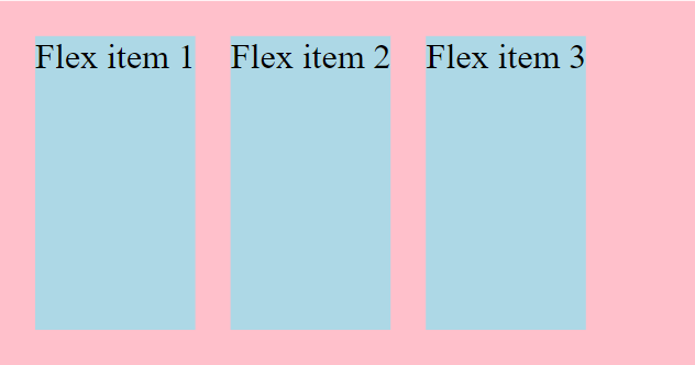
-
if we set
flex-grow:1;to an element then that item takes up the empty space left in the flex-container after all the other items take up their space. As you can see in the figure the flex-item-1 is larger than the other two flex items as it’s taking up the remaining space left after those remaining two take up their space.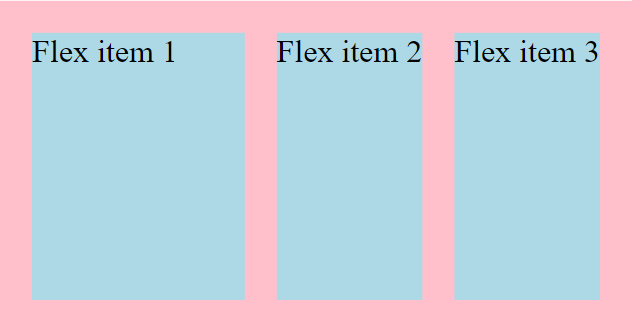
-
The item with higher flex-grow value will grow faster than the other flex-items in the flexbox.
-
Growth of items depends on the amount of available space present in the flexbox.
2. flex-shrink :
-
The flex-shrink property specifies how the item will shrink relative to the rest of the flexible items inside the same container.
-
By default flex shrink is set to 1. i.e.
flex-shrink:1; -
if we set the value of
flex-shrinkto zero, it will stop itself from shrinking. -
The higher the value of shrink is the more it shrinks faster. for e.g. if the flex-item1 has higher shrink value than the flex-item2 then it will shrink faster than flex-item2 and become more smaller also.
-
Syntax :
/* <number> values */ flex-shrink: 2; flex-shrink: 0.6; /* Global values */ flex-shrink: inherit; flex-shrink: initial; flex-shrink: revert; flex-shrink: revert-layer; flex-shrink: unset; -
The flex-shrink property is specified as a single
<number>i.e. values b/w [0,∞] -
We can’t specify a negative value to the flex-shrink.
3. flex-basis :
-
flex basis specifies how much space does the flex-item want to be taking up if it has the available space.
-
flex-basis is set to auto by default i.e.
flex-basis:auto; -
if flex-items has not much available space then the
flex-basiswould not work as they’ll only take up the space what’s specified in flex-basis if the space is available.
A deep dive into flex-grow, flex-shrink & flex-basis
Let’s understand all the three concepts clearly with illustrations :
In the above image you can see there are 3 flex-items which have the following properties :
.one {
    /* prevents items from growing */
    flex-grow: 0;
    /* makes the items shrinkable */
    flex-shrink: 1;

    flex-basis: 250px;
}

.two {
    flex-grow: 0;
    flex-shrink: 1;

    flex-basis: 250px;
}

.three {
    flex-grow: 0;
    flex-shrink: 1;

    flex-basis: 250px;
}
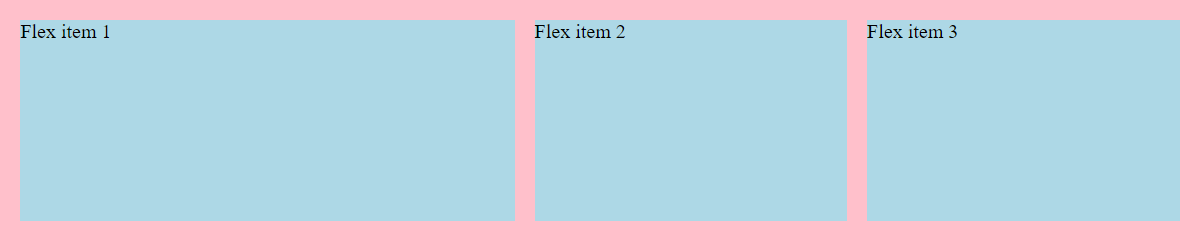
flex-grow & flex-shrink have the default value whereas the flex-basis has a value of 250px, it means if the amount of space is available for the items to take up then they’ll take up the 250px space as specified in above code. And you can see all the three items are taking up 250px and there’s still some space left in the flexbox container that’s because flex-grow is set to 0 (default). and if we shrink the flexbox the flex-items will also shrink accordingly (see the below image) as they have flex-shrink set to 1 (default). Even if we don’t specify the flex-grow & shrink values the default values will apply anyway.
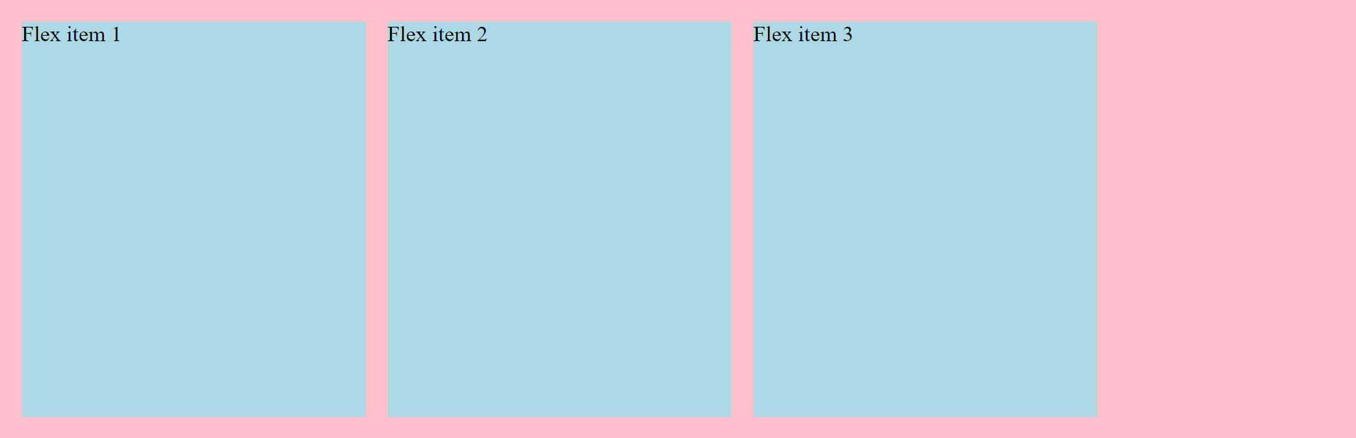
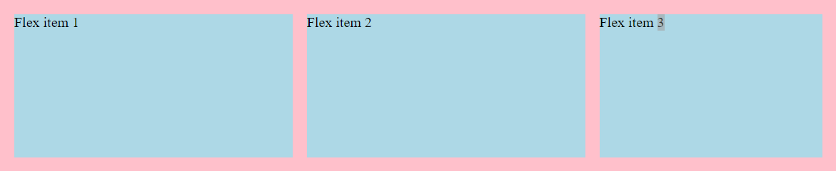
Now, if we change the flex-grow to flex-grow:1; in the flex-item1 then what will happen is that the flex-item1 will grow and fill the empty space available in the flexbox like given in the image below.But the other two will remain the same.
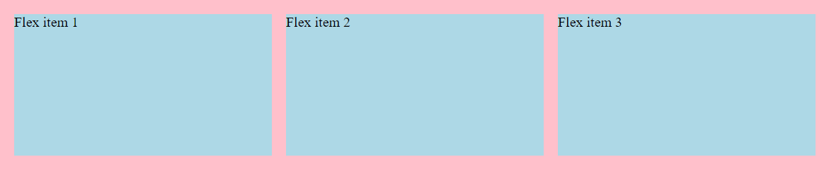
if we do the same to the flex-item2 then it will grow same as the flex-item1 and fill the empty space. Here both the item will grow equally and at same rate. But still the third will remain the same.
see the below image for clear understanding.
Same thing will happen if we apply the property to flex-item3.Here, all the items will grow equally.
Same thing will work with the shrink property too. They’ll shrink according to their shrink value.
Conclusion :
-
flex-grow value = speed of growth of item
-
flex-shrink value = speed of shrink of item.
4. flex :
Short hand for applying all these properties in a single line :
/* flex : flex-grow | flex-shrink | flex-basis ; */
flex : 0 1 250px;
5. align-self :
-
it works same as the
align-itemsproperty except it only aligns itself i.e. the specific item which we want to align.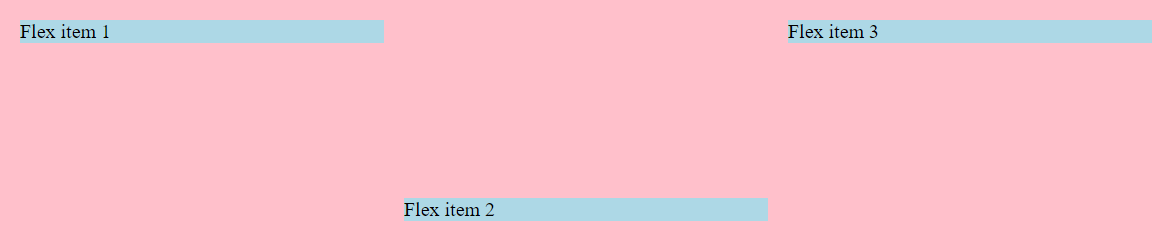 In the above image
 align-items:flex-start;is given to the flexbox &align-self:flex-end;to theflex-item2so it goes all the way to end (in the cross axis). -
if we remove the
align-itemsproperty from the flexbox then it will take the default property ofalign-itemsi.e.stretchand will make the other two flex-items stretch to the fill the container vertically or cross-axiswise. see image below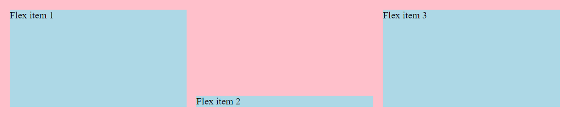
The last property remaining is order let’s see it & understand how it works.
6. order :
-
The
orderproperty specifies the order of a flexible item relative to the rest of the flexible items inside the same container. -
ordertakes integer as the value e.g. -1,0,1,2 etc. -
The default value of
orderis 0. it means the item will remain in the order as specified in the HTML file.
Let’s understand with example how the order will work.
.one {
    flex-grow: 1;
    flex-shrink: 1;
    flex-basis: 250px;
}

.two {
    flex-grow: 1;
    flex-shrink: 1;
    flex-basis: 250px;
    align-self: flex-end;
    order: 1;
}

.three {
    flex-grow: 1;
    flex-shrink: 1;
    flex-basis: 250px;
}
In the above code you can see the .two or flex-item2 has the order of 1. and other have no order value so it will take 0 as the default order.
The items with order:0; will remain same as earlier with no changes but the flex-item2 whose order we set to 1 will move to the last as it’s the highest order value among all items. See image below.
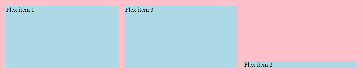
Conclusion : The item with less order will appear before and those with the higher order value will appear after the items with less order.